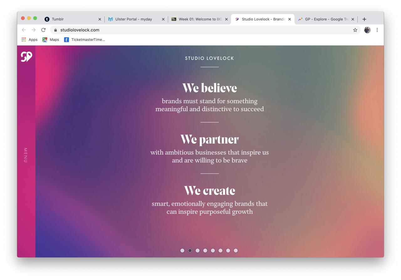
When visiting their site, the first piece of content you are presented with is their company slogan or mantra “Branding to Engage and Inspire” along with a call to action to view their show reel which leads to a youtube video - another engaging way to show content to the user, the landing screen also includes a series of slides which move across to show more key information such as their 3 main focusses within the company (shown below), examples of their recent work and finally their contact information.
When I continued to review their content through the menu panel I realised the about us panel uses the same slideshow format, this breaks the content down for the user in a visually appealing manner and allows them to focus on one section at a time. It includes who they are as a company, their approach, their process/services and some of their previous clients. The final screen shows a call to action for them to be contacted, again pushing the viewer to get in touch with the company.
The work they have done is presented differently as it is now a scrolling layout with various sections being split by colour and images to separate each piece of content from each other. When discussing the work they have done they include the background, the challenge, what they delivered, their strategic and creative approach, the solution, the brand guidelines, a short brand animation, the brand website and collateral and a testimonial. These sections of content are all paired with mockups to show the user the product that the content explains.
The final piece of content that their menu includes is a contact email address and phone number along with links to their social media platforms.
The content on their website is presented very well to the viewer and has good information hierarchy in place, knowing the landing screen holds the most important information and then going to the menu for the less important information. The content is what i would describe as smart content, there isn’t a lot of it but what is used makes sense and is all that is required to inform the user.
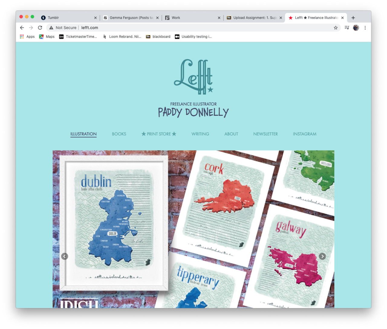
When visiting Donnelly’s site, the first piece of content you are presented with is his company logo “Lefft” with the main site nav below the logo and subtitle. Immediately after we are presented with a slideshow of popular works - immediately engaging the user. This is followed by a grouped block of images of previous works, showing in what styles Donnelly can work in. At the base of the Home page we are shown contact links to his email and social media platforms along with a link to subscribe to his newsletter.
When I continued to review their content through the menu panel I realised the Books tab shows all books he has illustrated and written and when the print store is clicked it redirects the user to a new website - held within the same tab. For my website any links to other website I will open in new tabs.
The next tabs include a writing tab, which moves into a blog area with a clickable grid allowing access to each individual post. A blog is something I could consider to include in my website instead of using other platforms such as medium. The About tab only includes a very minimal amount of information about Donnelly himself.
The final two links simply link to the newsletter and Donnelly’s instagram, both still opening within the same tab. These links overall provide the website with easy access for the user to the platforms in which Donnelly wants them to access.
The content on his website is presented to the user in a way that suits his brand and it has a good information hierarchy in place with his menu tabs going from most to least important - in my opinion. His landing screen holds the information that is best suited to his brand and what content user’s want to see when they visit his website, such as his style of illustration. The content he includes in his website is what i would describe as smart content, there isn’t a lot of written content but what he does write makes sense and is all that is required to inform the user.