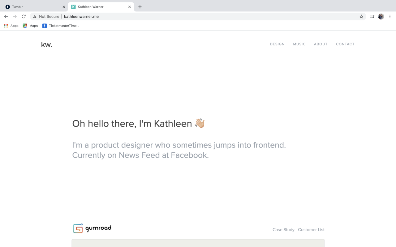
For my website, I have decided that a minimal design with added colour tones would fit my brand best. People I have taken inspiration from for this include Kathleen Warner, the use of white space lets the design speak for itself, however at times such as when speaking about her work she could explain more and show more of the process she went though as she shows minimal sketching. I also like how she uses two tone text, this easily includes information hierarchy into the portfolio site. Finally, I really like the use of emoji’s throughout her page, it makes it feel a lot more lighthearted and conversation like, breaking up the blocks of white with small coloured icons.
I appreciate the layout of the website also, the case studies following straight on from the landing page, this gives the viewer easy access to your work. Finally, I like her offset menu on the right, balancing the page with the monogram on the left.
Looking at Warner’s website has been a very helpful process and has provided inspiration for my wireframe creation and has inspired my minimalist landing screen.