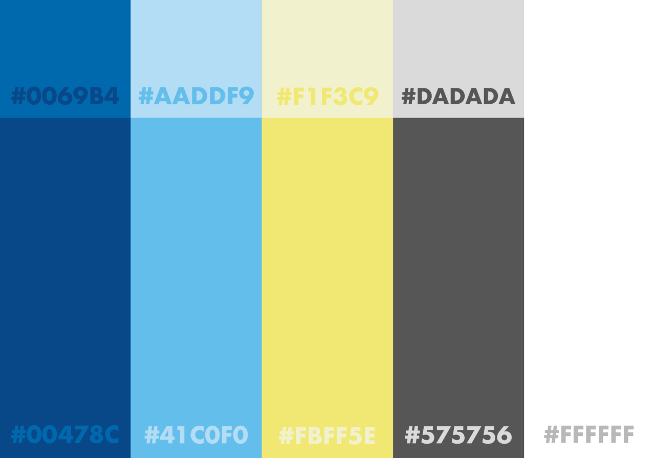
To establish what colour scheme my digital product should have I researched into colours used by sports brands and competitions, including Lucozade Sport, American Open, BT sport and the Austrailian Open. These products all use similar colours Blue, Yellow and White.

https://64.media.tumblr.com/75bc13196ac737a86778d590454c5557/6174612971c305de-0f/s1280x1920/65073b26ef7ccba6391e3ec41c11b96cf6044676.png

https://64.media.tumblr.com/492698129c3a95cd4afe3882e188b0c7/6174612971c305de-d7/s1280x1920/2677a19aaea0692bcf9097069b049a78d58fab2f.png

https://64.media.tumblr.com/a290451f59e6ea87c1053ea3c6fc34f8/6174612971c305de-a8/s1280x1920/377ffbc5a8d6c173b286085fa3553fc57ea6ffbb.png

https://64.media.tumblr.com/1e68e2d91d5befede95ee0f21fce41d4/6174612971c305de-b6/s1280x1920/a75a00e672a69d07734c1511a2bce873d2991f46.png

https://64.media.tumblr.com/5faea49e56aee81d1a9ca78fe5039644/6174612971c305de-57/s1280x1920/aa82d9aa51025bfc6ac57658c0dae4e5bee95a25.png

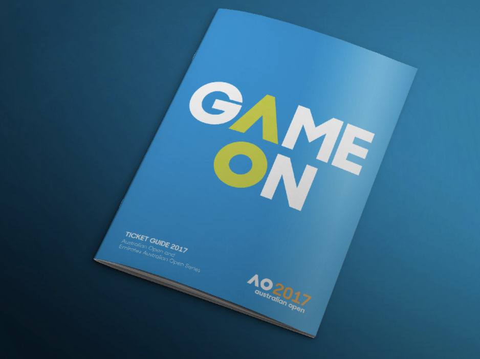
From this I have established that these colours are often associated with sport and work very well together. The Blue and Grey in my scheme are able to be used often and when paired with the yellow it works well as a contrasting colour. I used adobe colours to do further research and then created a colour scheme on illustrator. These colours have two tones so that they can be easily contrasted and in situations where the dark colours are too overpowering the light colours can be used, the colour scheme can then be consistent throughout the whole product.

https://64.media.tumblr.com/964d1445173b05a49ab3f2def5b35f7a/6174612971c305de-ad/s1280x1920/1aac011aceb8ab4c7b96fbccf8fdd1a79a7511c9.png

IXD302 - Creative Entrepreneurship