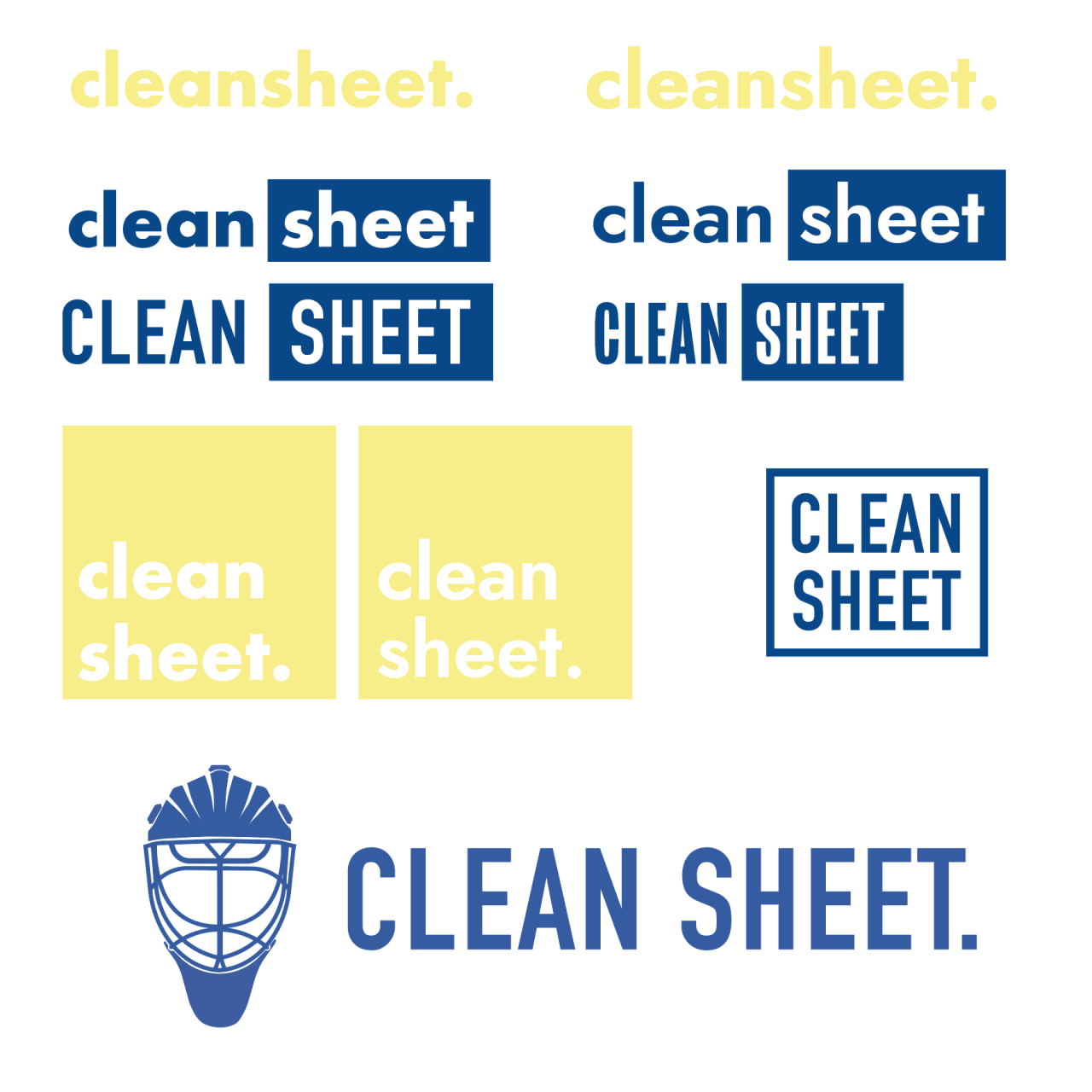
After establishing a colour scheme and sketching my ideas, I digitised these and used tones from my colour scheme. I think the more simple ideas work best rather than the illustrated goalkeeper helmet, I also prefer the rounder typefaces than the condensed typefaces.
My favourite of these is the simplest of the logos shown above, the small case and round typeface will be fitting with the style I have in mind for my product.
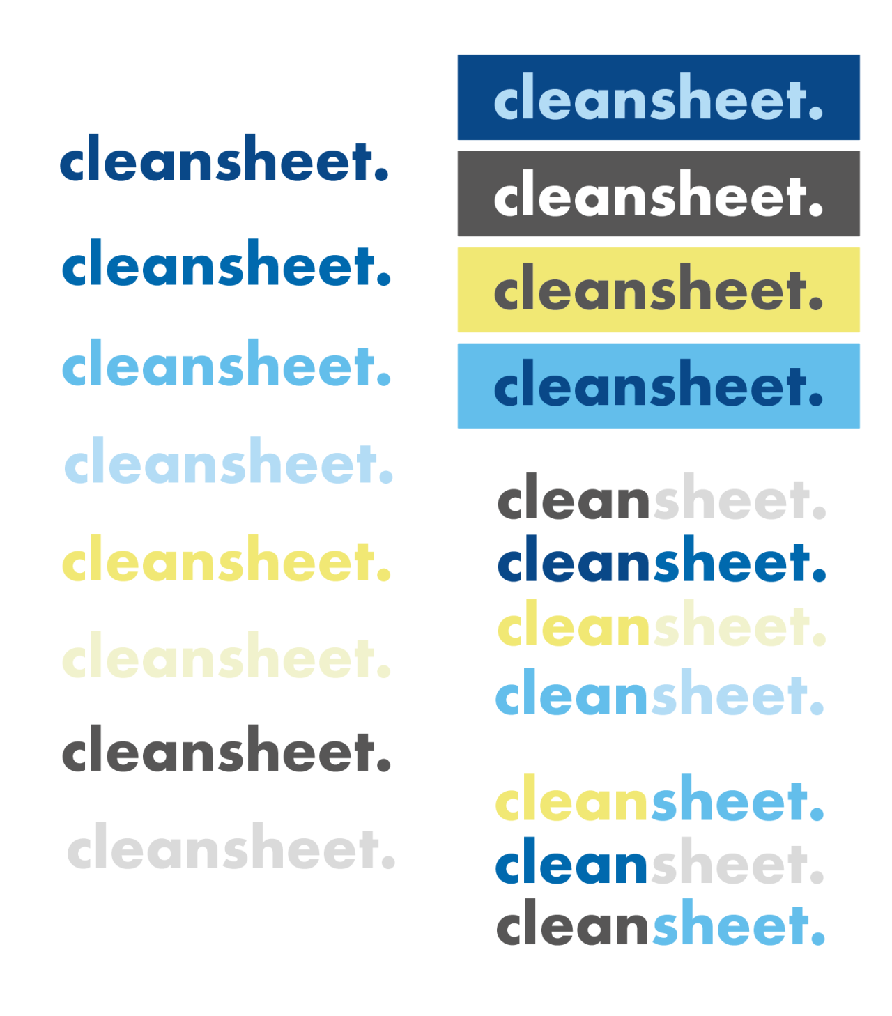
Following this decision I experimented with colours and the aspect of using two colours within one logo, or placing the whole logo inside one square. These are all options for my logo and was a helpful process to go through.