As I continue to develop my digital product, I decided to start thinking about how I will lay out the guide itself, where diagrams will be located and where photos will be located. Over the next week I am going to take example photos of good and bad technique to add into the guide and also will develop session plans.
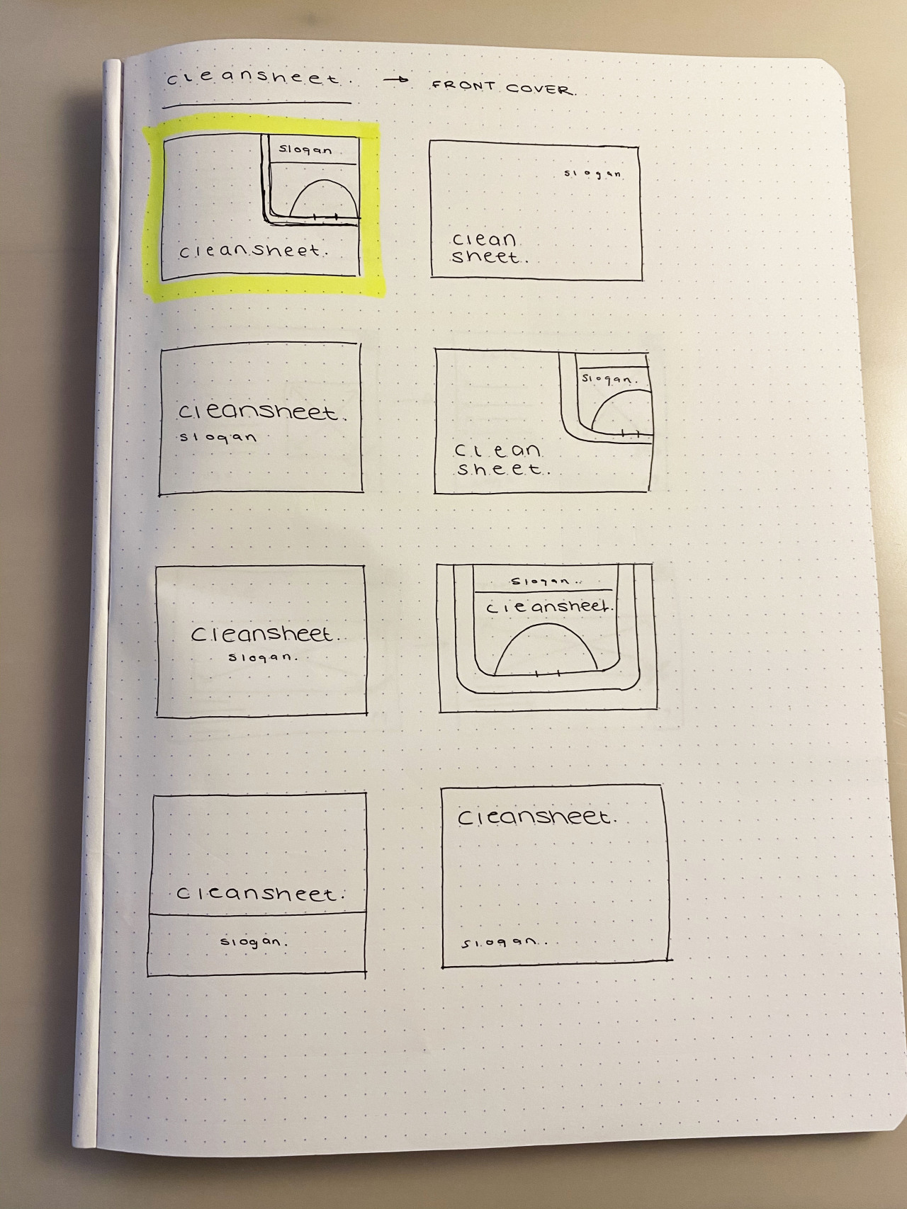
First I looked at the front cover page, this page needed kept simple with the only real elements consisting of the title and the slogan. I added an extra element of a hockey pitch in on some ideas to create more of a design element within the page. I liked this idea and my final choice is highlighted in yellow. The use of information hierarchy allows for the larger main title to be read before reading the smaller description within the hockey pitch.
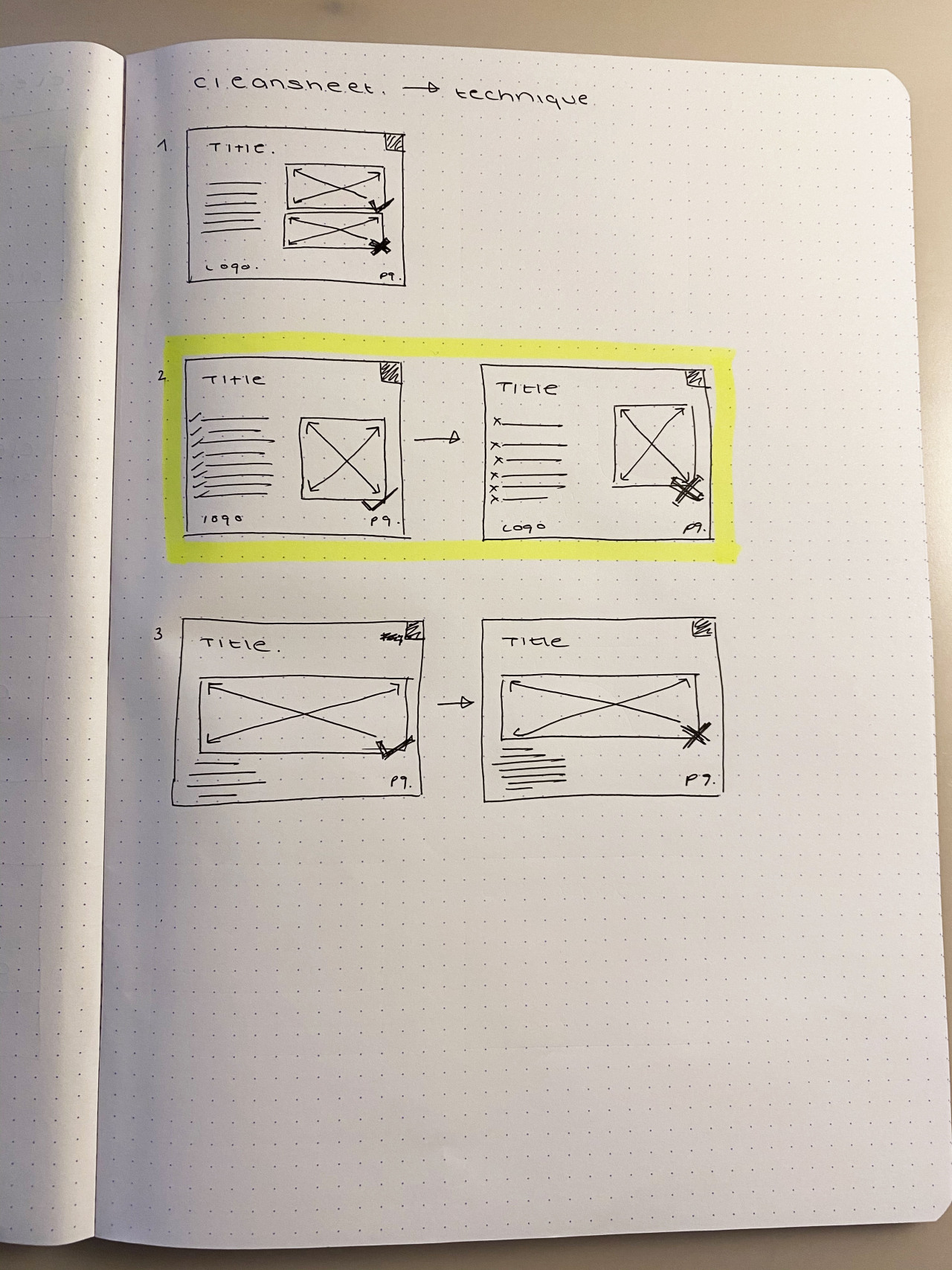
Next I looked at the technique pages, these had more information to fit in. They have to include coaching points and photo examples. I found that trying to fit the right and wrong images in one page seemed very tight so decided on two pages per technique to easily show the right and wrong ways to perform the skill. This also allows for the image to be larger and therefore clearer to the viewer if they are viewing on a device with less real estate, such as a mobile phone.
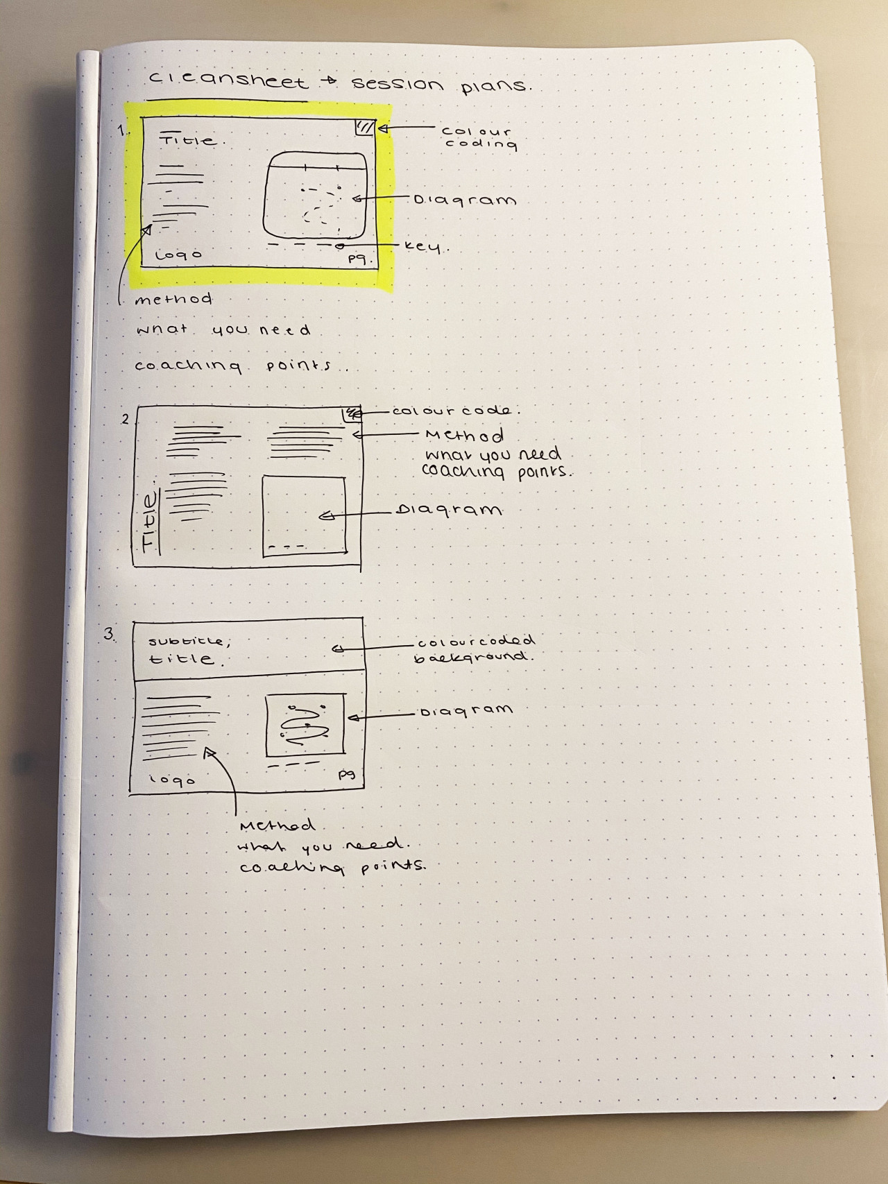
Finally I looked at the session plan layout, this would be the page with the most information. Having to include the method, what the drill required and the coaching points along with a drill would leave little white space if not laid out correctly. For this i decided to maintain the white background and include only one small colour square in the corner to match the colour coding system which will be in place throughout the guide. I have placed the diagram on the right of the page along with a key, with the intention of splitting the three information groups into three sections on the left, this will allow the eye to read the information before looking at the diagram.