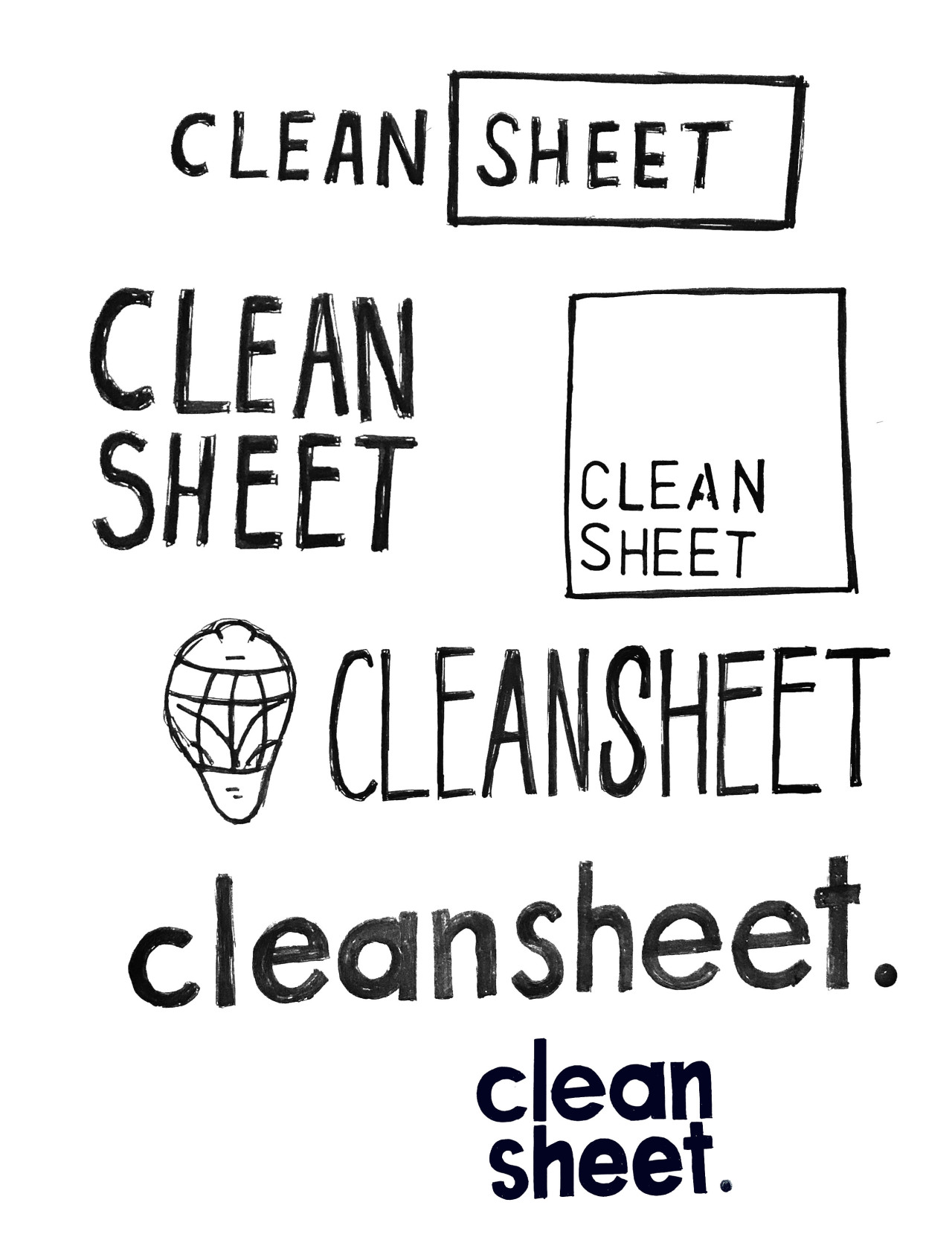
For my digital product, I have started to create the brand and style of which the eBook will designed in. To start this process I sketched a series of logo ideas to which I have included some of below, I think with the name “clean sheet” (referring to a goalkeeper having conceded no goals in a match) it would make sense for the brand to be minimal in design.
There is potential to merge some aspects of these ideas to make a better logo, I like the use of small case letters in the lower logo options shown above but also think the use of the square/rectangle is interesting and would be good to see how these aspects pair together. Moving on from sketching I will start to create a few ideas digitally so then I can establish what my products logo will be.